
At the end of May I published a poll on the Newark by-election which put the Conservatives well ahead of UKIP, by 42% to 27%. This raised a few eyebrows, both within parts of the polling fraternity and beyond. Surely the Tory lead was too big? Surely I had missed the UKIP insurgency that would follow their victory in the Euro elections two weeks previously? Surely I was overestimating the number of Tory voters from 2010 who would turn out for the party again despite saying they didn’t know how they would vote?
When the ballots were counted four days after fieldwork ended, each party’s vote share was within the margin of error of my poll. I had been within a point on UKIP, who scored 26% (so much for understating them), two points on Labour, three points on the Liberal Democrats and three points on the Conservatives – whose share was higher, not lower, than in my survey.
As I always say, a poll is a snapshot, not a forecast, so I can’t have it both ways when one of mine is proven to be accurate. But the reason I mention it now is that the methodology used in the Newark poll is essentially the same as that employed in the Ashcroft National Poll, which has come under a good deal of scrutiny in the last couple of weeks. How could the ANP find a 2-point Conservative lead one week and a 7-point Labour lead the next? Is there something wrong with it?
First, it is worth reviewing how the ANP works. Each weekend one thousand adults are interviewed by telephone. Half the interviews take place on landlines and half on mobiles, to reflect the growing number of mobile-only households. Calls are made at random but quotas are set to ensure the sample is representative by age, gender, region and social group. The sample is also weighted to ensure it is politically representative according to how people voted at the last general election, with some allowance made for false recall.
Respondents are asked how likely they would be to vote in an election tomorrow on a ten-point scale, and weighted according to their stated likelihood to turn out. When asked which party they would vote for in an election tomorrow, a proportion of those who refuse to answer or say they don’t know are allocated to the party they voted for in 2010. This measure, sometimes called the “spiral of silence” adjustment, was developed to help account for voters who are reluctant to say which party they plan to support even though they have really decided – a factor that has been significant in previous elections, particularly in 1992 when all polls significantly understated the Tory vote share and some suggested the wrong winner.
Each polling firm does things slightly differently. Online pollsters often have different procedures, such as selecting their sample from an existing panel according to people’s previously stated party identification (an important difference from random telephone surveys), or leaving out the spiral of silence adjustment on the grounds that people are not shy about admitting their intentions by clicking a box on a screen.
But the ANP methodology is well established in the polling industry and has been tried and tested at successive elections. Why then, is my poll so much more volatile than every other poll?
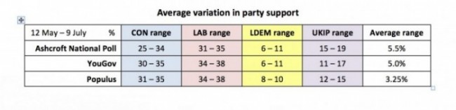
Well… it isn’t. Since 12 May, when the ANP was first published, the average variation in vote share (that is, the range from the lowest to the highest score for each party) has been 5.5%. In YouGov polls over the same period the average variation has been 5.0%. Populus, whose average variation is 3.25%, last week found Labour and the Conservatives within a point of each other, followed by a 7-point Labour lead within the space of three days – never mind a week.
It is no coincidence that the three pollsters finding the biggest variations in vote share are also the three who publish most often. All pollsters are subject to the same statistical reality, which is that 19 times out of 20 your results will be within the margin of error (itself determined by the sample size): the more polls you do, the higher the risk of fluctuations. Moreover, when a firm publishes polls at wider intervals, the passage of time and events can help explain movements that might really be down to random volatility.
That is not to say that these variations are always down to error. Party support really does move around, for all kinds of reasons. This is not surprising in the current climate, in which voters prefer one leader but a different party, are uncertain about the economy and whether the alternative party of government can be trusted to manage it, smaller parties have enjoyed unusual prominence, and a general air of distrust and distaste prevails.
Sometimes the changes are real but transient, sometimes they are down to the sample, and sometimes the shifts are more significant and enduring. To make sense of them we need to look at the polls as a whole. And within any one series of data, we need to look at the longer term trend, not just the shifts from week to week.
In the case of the ANP, the Tory lead in the first instalment was matched the same day by a poll from ICM. My second Conservative lead at the end of June – within the margin of error of being a Labour lead – also reflected a general narrowing in the polls. This week’s 7-point Labour lead was matched by polls from YouGov and Populus, with Opinium putting Labour ahead by six points.
The Ashcroft National Poll, May – July 2014
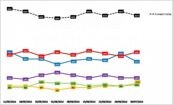
The most interesting difference between my weekly telephone poll and the most frequently published online polls is not the levels of “volatility”, which are comparable, but the consistent differences in the combined share of the two main parties. At the 2010 general election, Labour and the Conservatives together received 67% of votes in Great Britain. Over the life of the ANP, YouGov and Populus have consistently found the combined two-party scores to be higher than this, and often above 70%. The ANP, meanwhile, along with telephone pollsters ComRes and ICM, have found lower combined totals in some cases closer to 60%.
This is a notable difference given that combined support for the two main parties has been in decline for sixty years. Could we be seeing a reversal in this trend? Or do the higher scores for established parties from these online pollsters reflect the inclusion of party identification in their methodology?
This is by no means to criticise my polling colleagues, who generally take an open-minded approach to questions like this. Anthony Wells of YouGov, for example, writes a very thoughtful and balanced polling blog which as well as being an excellent source of data serves as a prolonged reminder to distinguish the wood from the trees. As I said when launching my polling programme for the year to the general election, all pollsters grapple with methodological dilemmas with the aim of measuring opinion as accurately as they can. As they do so, the numbers bounce around a bit, both because of the statistics, and the voters.
But over time, they tell a story. And in the Ashcroft National Poll, the story so far is of a Labour lead broadly in line with that found by other pollsters, but with the two main parties commanding less support between them than is often reported elsewhere. Will that discrepancy persist, or will telephone-based polls like mine find rising support for the two main parties as we move into the autumn?
The weeks and months either side of the European elections have often been the times when parties like UKIP and the Greens have done best in the polls. How long that effect will last this time, and to what extent, is a far more interesting question and more significant to the outcome of the general election than variations from one week to the next in a single poll.
Over the last decade my research has looked at some of the central political questions of the time – why the Conservatives persisted in losing elections, attitudes to public policy issues including Europe and immigration, the political outlook of ethnic minority voters, the rise of UKIP and the challenges facing each of the established parties. The research has been on a large scale and published in full, so others are free to take or leave whatever lessons are to be learned.
The same is true of the ANP – except, of course, that other voting intention figures are published on an almost daily basis, so people can – if they are so minded – pick the ones they like best. Like all pollsters, I have become used to being praised if a single poll fits with people’s hopes and expectations, and criticised if it does not. The purpose of polling is not to prove a point but to try and provide – within the laws of statistics – an honest snapshot and a measure of opinion over time. That is what I will continue to do.